

Forbidden Flowers
Services: User Experience and User Interface Design, Animation
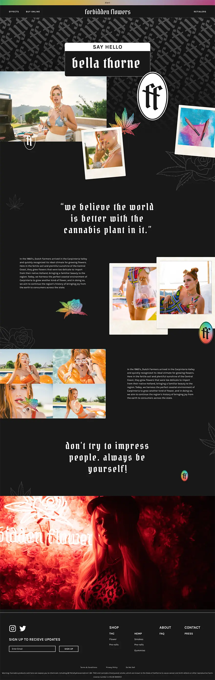
Forbidden Flowers is a cannabis line backed with the star power of Bella Thorne and run by cannabis industry vets Glass House Brands. Forbidden Flowers challenges the stereotypical image of the male slacker cannabis consumer, projecting a strong, energetic, feminine image.
See the Live Site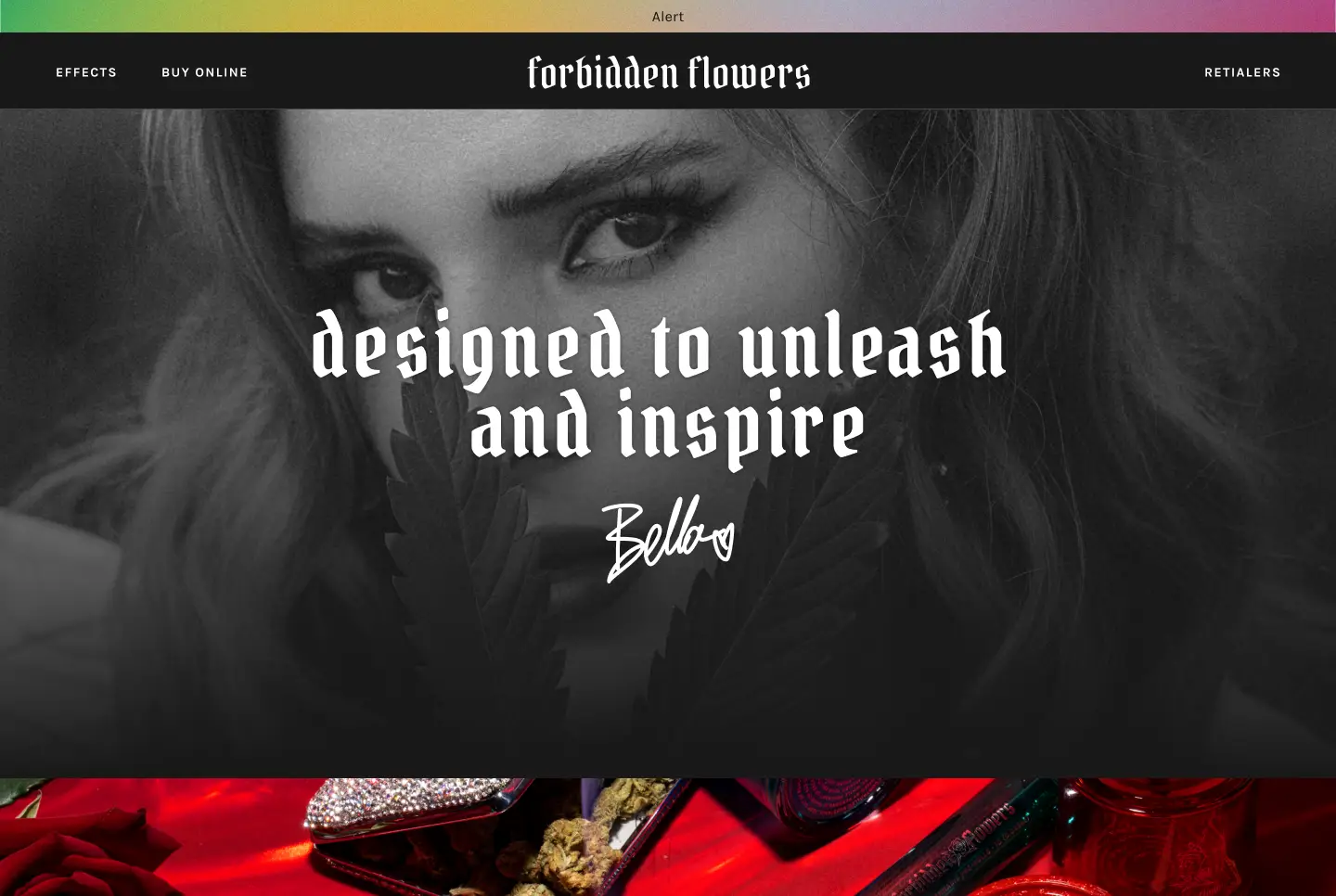
The Challenge
Forbidden Flowers was getting ready to launch a new product line. With the announcement of their new range, they wanted to create a website that would provide a more notable first impression for the brand. The items themselves weren’t the only thing that was new - they were also introducing a system for categorizing them that would need to be taught to the new users.
Our Approach
Our solution for Forbidden Flowers was a visual-heavy site that highlighted the important lifestyle aspects of the brand.
User & Competitor Research
To establish a better understanding of the industry, we started with an analysis of some of the brand's biggest competitors. We saw a preference from consumers for a contemporary, editorial approach to UI and visual design. Despite the style, we noticed an opportunity when it came to substance. This editorial style wasn’t always matched as well as it might have been with appropriate lifestyle content.
After reading through further market research, we saw that young, LBGTQ women have historically been underserved in the industry despite using cannabis at higher rates than their peers and their willingness to experiment with a range of products.
User Experience, Interface Design & Branding
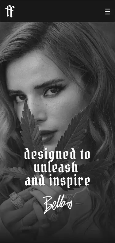
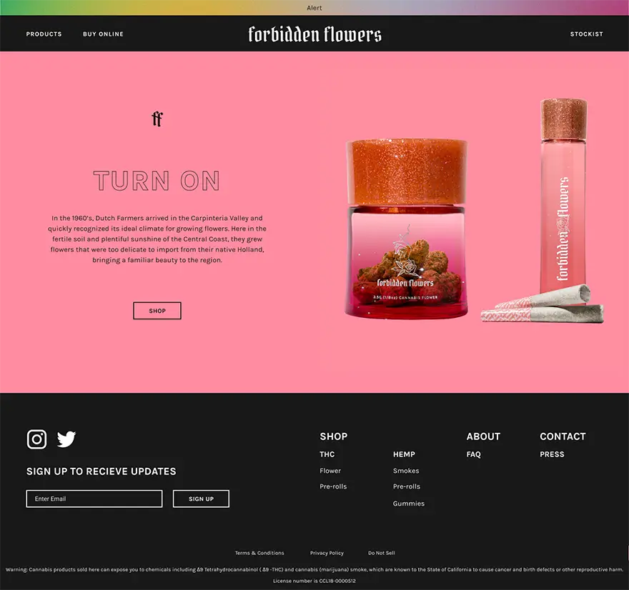
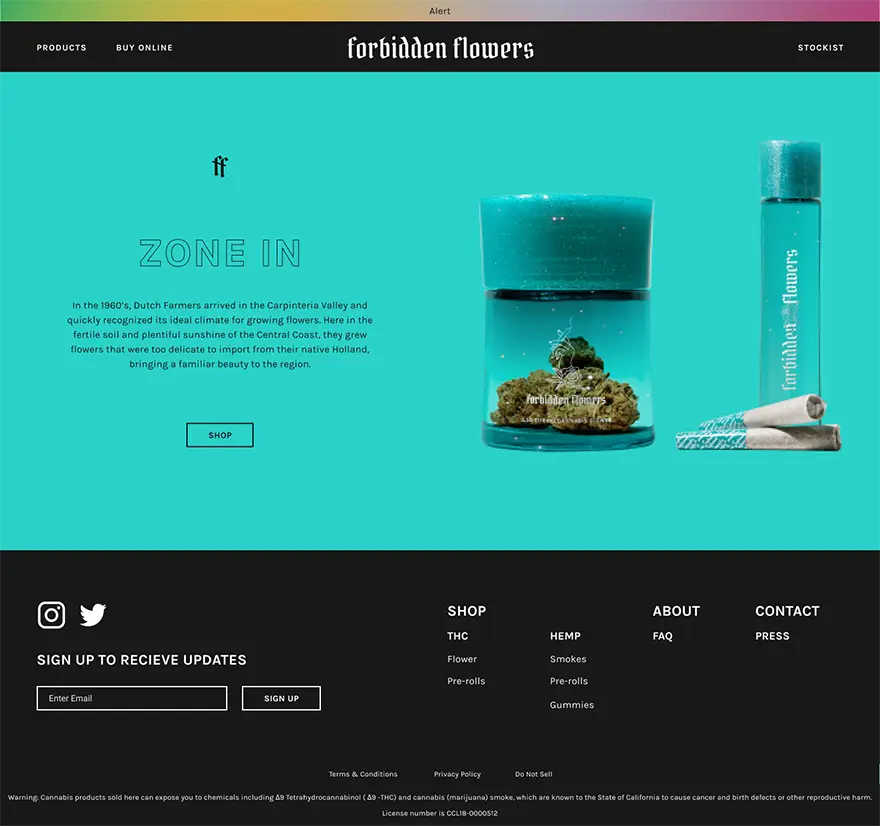
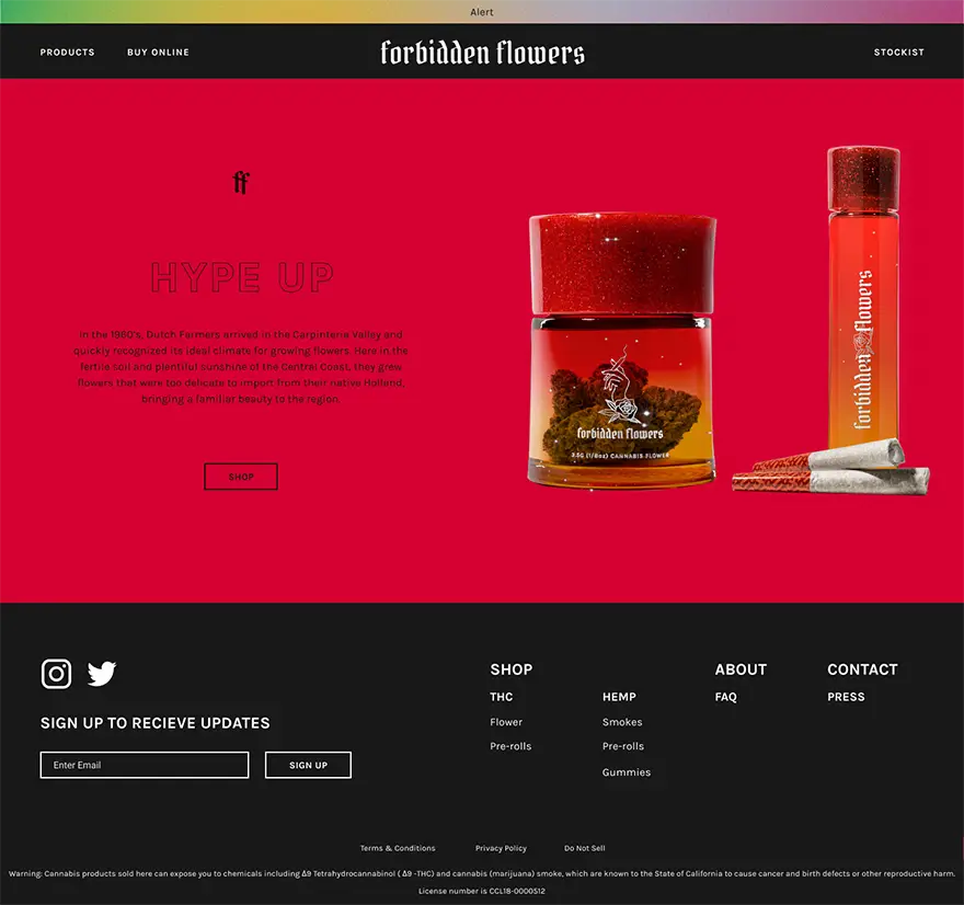
To make a strong first impression with the visual design, we leaned into the brand’s bold color scheme, placing pops on a black background to maximize vibrancy. Along with graphic color blocking, we provided ample space to show off their stylized lifestyle photographs. These were contrasted with big and bold white-on-black typography. Finally, we added motion to bring it to life.
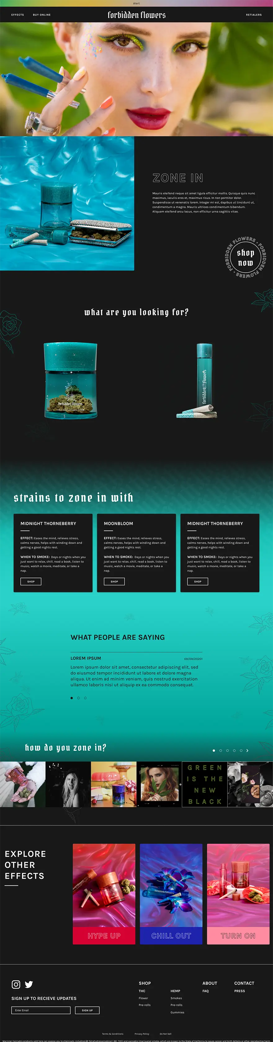
As for the structure, we needed to highlight the effect-centric schema with which the new product line was organized. On the homepage, the effects are displayed prominently and coded to begin to establish color-effect relationship. As a way of providing users with a more interactive, fun way of learning about the labels, we created a quiz where they could find out which one was for them. Along with those strategies, we also created an ‘effx’ page that provided a high-level overview of intended niches for each product.
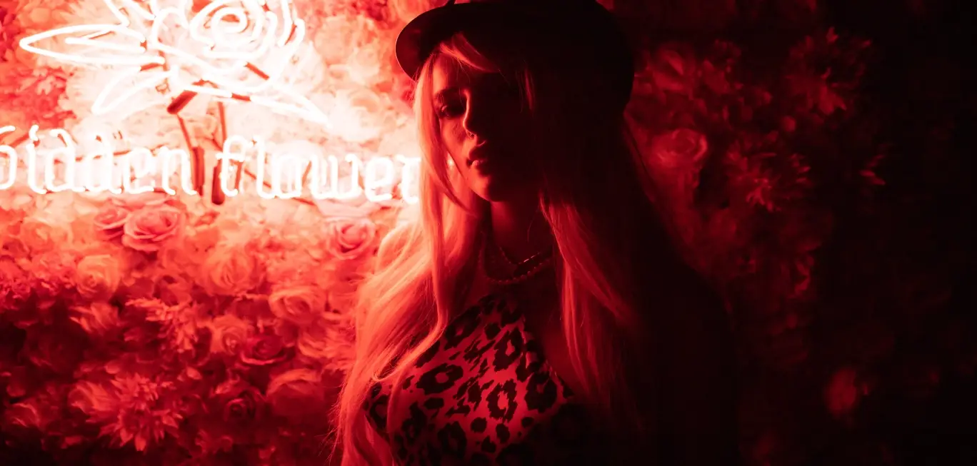
The lifestyle approach was continued on the product pages. Because of the legalities of the cannabis industry, the product pages had to be oriented towards information rather than purchase. We used this in our favor with each product page providing space to highlight the activities that are recommended for pairing with each effect. The pages feel more editorial than sales oriented with a heavy focus on imagery.
Finally, we wanted a space to welcome the fans of Bella and introduce those who might be less familiar with her. For this, we created a page with an open, scrapbook feel highlighting her career and her involvement with both the brand and cannabis more generally.
Product detail page
About Forbidden Flowers
More Case Studies
Opal
Services: User Experience and User Interface Design, Icon Illustration
Creating a calming interface to ease the cremation process for the bereaved
VIEW THE PROJECT
Greenwolf
Services: User Experience and User Interface Design, Branding
Uniting touchpoints of a Los Angeles Cannabis brand for a more cohesive user experience
VIEW THE PROJECT