

ContinuEM
Services: User Experience and User Interface Design
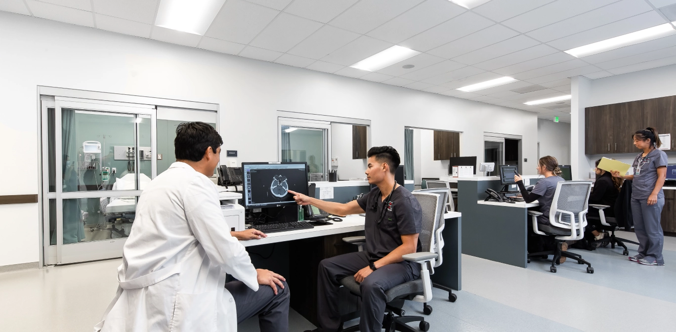
ContinuEM offers urgent care services in the South Bay of Los Angeles. They run a well-trained team that has the tools and experience to handle a broader range of cases than a typical urgent care center.
See the Live Site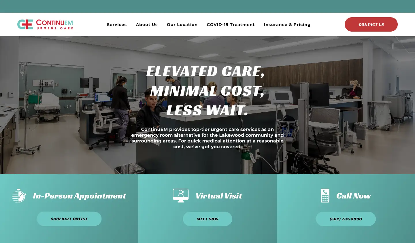
The Challenge
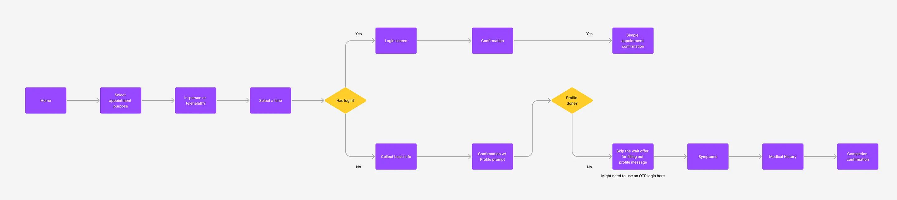
Our task was to create a site that would help drive visits for ContinuEM. There were opportunities with their existing site to improve the appointment booking flow. Within that appointment flow, we had to pay careful attention to differentiate between regular and COVID-19 appointments. While a user might not inherently understand the need to keep them separate, it was a requirement for business safety. Along with that, we had a chance to improve transparency by making information more readily accessible to our audience. As a newer urgent care in the area, ContinuEM needed us to help raise its profile.
Our Approach
Our solution for Continuem was to create a site that made booking easy as a primary goal, while also providing space to educate patients about their other services.
User & Competitor Research
We began our process with competitive analyses. We found some conventions around booking systems that would be familiar to our users. Given the immediacy and inherent levels of stress our users would be experiencing during their visit planning, we deemed it important to make the process as painless as possible. We also recognized the extent to which payment caused anxiety around medical visits. We wanted to address this by making any payment-related information clear and accessible.
User Experience, Interface Design & Branding
To address appointment booking first, we dedicated almost all of our initial viewport to appointment types. We broke out our appointment types into a row of three, using labels and icons to help differentiate between in-person, virtual, and COVID-19 visits. Along with the header option, we were sure to include an easy to use slide out menu for reaching ContinuEM that could be used throughout the site.
From there, we made sure to spend time providing users with any information that they would need to feel comfortable booking an appointment. This included taking time to give a face to the doctors and nurses who see patients as well as highlighting their experience and credentials. Further, we laid out to the ailments treated by ContinuEM to demonstrate the range of needs they can meet.
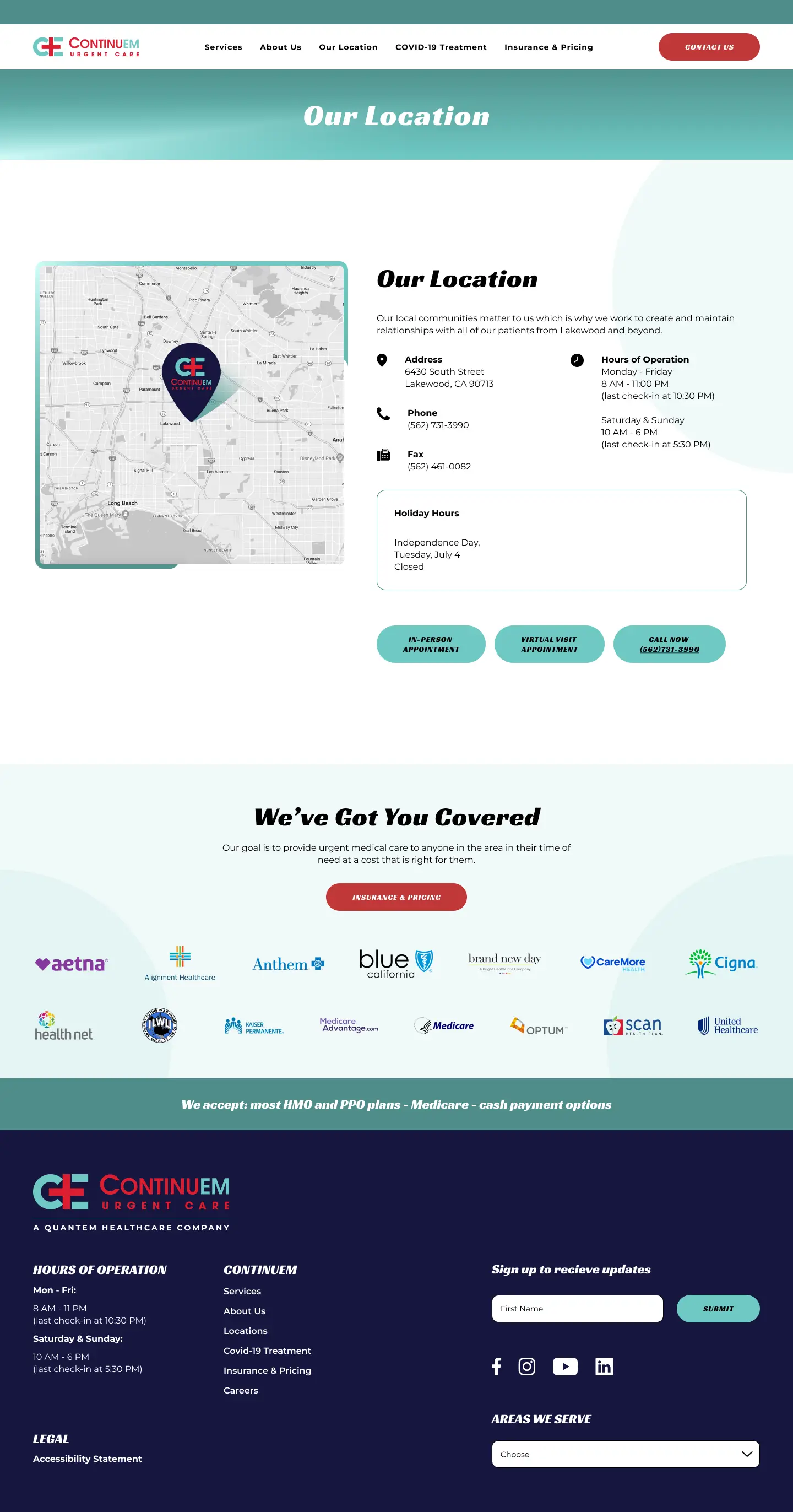
Our Location
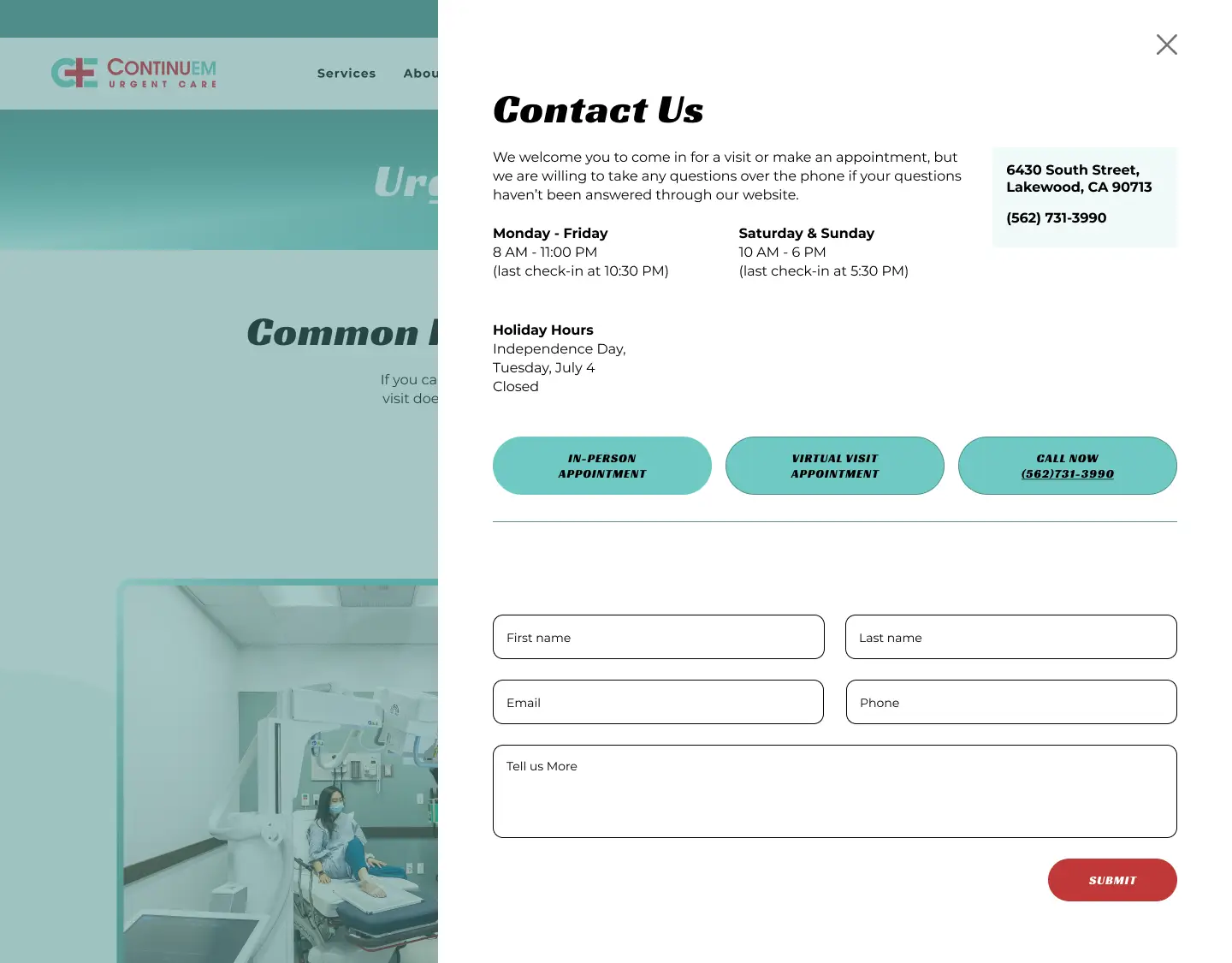
Contact Us
More Case Studies
Forbidden Flowers
Services: User Experience and User Interface Design, Animation
Building a digital platform to connect flight seekers with plane owners
VIEW THE PROJECT
Opal
Services: User Experience and User Interface Design, Icon Illustration
Creating a calming interface to ease the cremation process for the bereaved
VIEW THE PROJECT